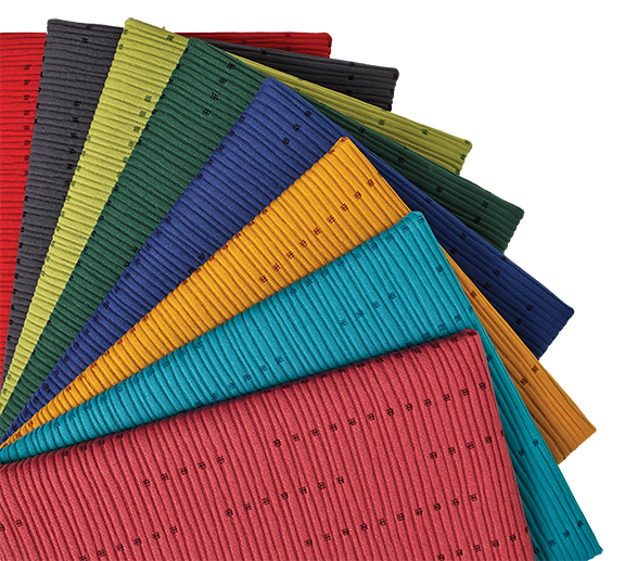
KnollTextiles’ Azuma Collection is inspired by Japanese design and culture. It offers four upholstery fabrics, including Sashiko (pictured), which features an understated matelassé upholstery in soft yet saturated colors.
In hospitality, accents and accessories are where designers have fun; fabrics remain relatively straightforward.
“Most of the fabrics we’re using are pretty simple. They don’t have a lot of pattern,” said Toby Schermerhorn, co-founder of Cauhaus Design. “Pillows tend to get thrown away or stolen, so that’s where we tend to get in our bold pattern and color. Everything else is background because it has to last a bit longer.”
Fabrics, especially in a hotel environment, will always need to remain durable, no matter the changing trends in color and pattern. “Wearability, cleanability and availability are all important requirements as durability and performance are key to success,” explained Neil Locke, principal, Neil Locke & Associates.
“Owners want something that’s inexpensive and that the brand will approve,” Schermerhorn said. “Brands will approve of something that’s available, on a budget and that doesn’t stain immediately.”
As designers delve into suites, however, more flexibility is permitted. “In suites, we can get away with a little bit more,” Schermerhorn said. “I tend to make them lusher. If I showed an owner a velvet in the guestroom that was in a solid, they’d have a heart attack.”
Velvet, a favorite of many designers, is becoming more prevalent. “Velvet is a very durable fabric, especially the new contract velvets,” observed Celia Barrett, principal, Barrett Design Studio. “So many high-performance fabrics now have 100,000-plus double rubs or features, like Crypton, that make them just almost indestructible. If we are using something like that, it must not feel too stiff or uncomfortable.”
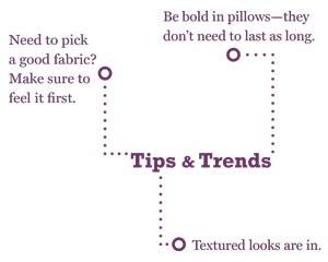 When it comes to fabrics, it comse down to how they feel. “One of the important things is fabrics can have a really horrible hand, meaning, when you touch them, they feel like you’re touching little pieces of plastic; they’re not sumptuous and soft when you run your hand across them,” Schermerhorn explained. “Because we don’t have a lot of pattern, it’s important that the fabrics have an appealing tactile experience. If I’m sitting in a chunky lounge chair with big arms, I want to run my hands across the arms and have it feel really plush and nice. The hand of the fabric is the most important thing to look for. I’m excited when it’s something I want on a chair.”
With the subtlety of color and pattern in most hospitality fabrics, Schermerhorn is excited by manufacturers weaving fabrics in an interesting way. “I love all the different knitting textures that have started to become incorporated into fabrics. It was really exciting to me when people came out with knitted blankets and throws. ”
A current trend in fabrics is color. “The biggest trend I’ve seen is transitioning from subdued colors to bright colors,” Schermerhorn said. “There’s a real interest in getting back to some color. Every once in a while, someone will have a hot pink or the new Pantone Color of the Year, and everyone will offer that.”
While bold colors change, classics never go out of style. “I do see lime greens going away and leaf greens coming forward,” Barrett said. “Teals, soft and on the blue side, are classic. Grays may be here forever. But I think we will add more taupes and tans again. I’m happy to see orange going away. Golds and blacks are fabulous now. We are also using soft creams and a variety of neutrals in the same project, then adding a sparkle.”
Locke cited an interesting source: the runway. “Fashion usually predates hospitality by a season,” he said. “Color trends seen on the runway are often requested a season later in the hospitality market.”
Textures are making more of an appearance in fabrics while patterns take a backseat. “I see less patterns and more solids with textures,” said Barrett. “In the patterns I do see, there are scribbles, polka dots and sparkling textures. We have also seen plaids in the new collections and the classic herringbone is still strong.”
Schermerhorn has also seen the decline in patterns: “It’s nice to shake it up sometimes. It was always chunky weaves, colors that were close in tone and they don’t have any patterns.
“My biggest request is that manufacturers come up with something else,” Schermerhorn continued. “I get really tired of seeing the same thing. Manufacturers find a product that sells well from one manufacturer and they want to jump on the bandwagon and provide their version. But I would challenge them to try to come up with something else. Don’t just follow somebody else’s trend.”